Gang!
Been banging out code for our completely Unfiltered search engine. I really liked the previous body of work regarding changing how the map displays where events or stories are located using a modification of a heat map. I just completed an update for map plotting of data for the Android, iOS and UWP devices.
This post will cover the following areas:
 Media Library ‹ Unfiltered Search Engine — WordPress.html
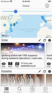
Here is what the new Results view looks like on the iOS with the light theme. The presentation of the data on the map now gives the user a quick idea of where in the world matches for that particular search are taking place.
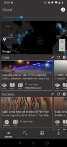
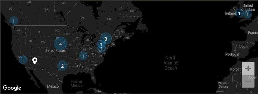
This is the Results view on a dark themed Android. Th visual presentation certainly is a much better layout of the data. This visual presentation is certainly better than a heat map.
 A visual that shows the main screen on a dark themed Android with the new plotting graphics
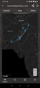
 Story Map. Displays the number of times a location was found
On the map that is displayed when the event is opened the locations that are found in the event are now plotted on the map. So you get a visual representation of how many times in the story the various locations were mentioned. This same behavior has been added to the UWP devices as well. All three updates should be hitting the app stores in the next couple of days (March 28th 2021).
That’s a wrap!
There we go… That’s the update for the map plotting of data. These changes into the Android, iOS and UWP stores next week. I’m going to be thinking about how I can visually represent the rest of the data as well. Displaying in a table format is decent. However I’m sure there are other possibilities that can be explored.
As always have fun with your completely Unfiltered search engine!

