Gang!
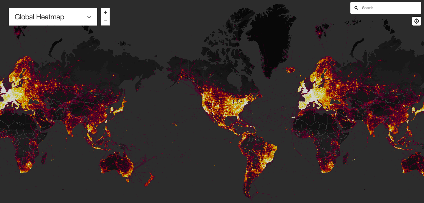
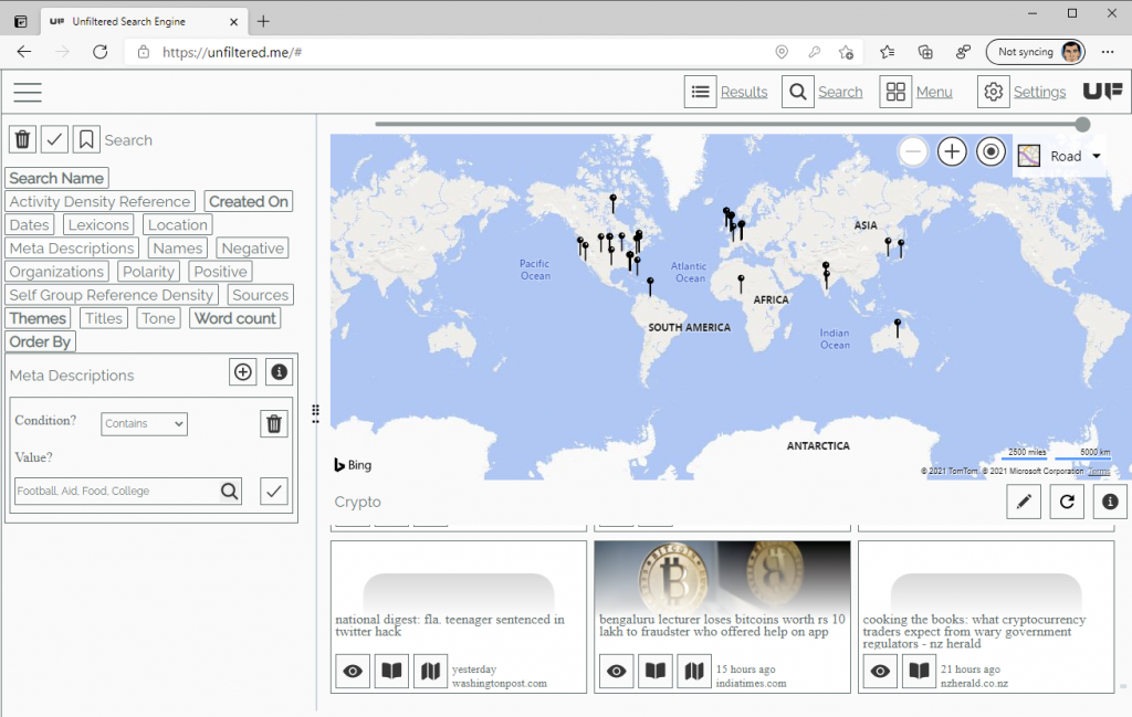
Got another update for your favorite totally Unfiltered web search tool. I really like data visualization this update provides. Pictures can communicate very effective data transportation mechanism. I’m sure you’ve all heard the bit about: “A picture is worth a thousand words.” One of the things I’ve been wanting to add to the Unfiltered search engine results is data visualization. I had pushpins in the map to mark the first location that the algorithm, by Kalev H Leetaru 2012, returned. But that started to be less than optimum when a large number of events were clustered in a location. I tried a traditional heat map. However that presentation of the data didn’t have the look I was after.
This post will cover the following:
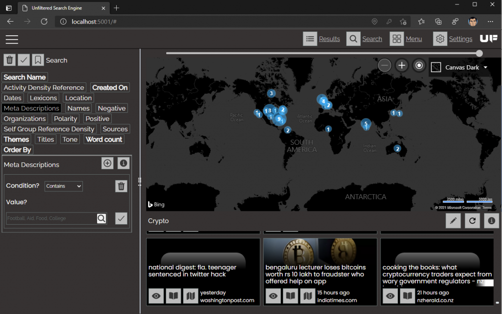
This is what I settled with. I removed the pushpin concept and created a semi-transparent circle that grows in size based on the number of events that it represents.
 Results. New map with SVG simi transparent circles.
Sometime next week I’ll add some code that will allow you to click on the circle and populate the search results with that collection. This should continue to develop out the theme of making the application more user friendly and make the data presentation more visual.
That’s a wrap!
There we go… Another update to the browser. I’ll be rolling these changes into the Android, iOS and UWP stores next week. I really like the way this presents the data.
As always have fun with your totally Unfiltered web search


